What Is the 70/30 Rule in Interior Design?
When designing a room, balance is everything. Too many competing colors or design elements can make a space feel chaotic, while a room that’s overly uniform can feel flat and uninspired. One of the simplest and most effective interior design proportion rules professionals use to maintain visual balance is the 70/30 rule.
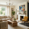
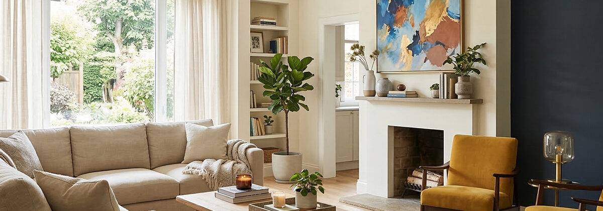
The concept is straightforward. In most spaces, about 70 percent of the room is dominated by a primary style or color, while the remaining 30 percent introduces contrast through accent elements. This approach creates harmony while still allowing personality and visual interest.
Understanding how to use the 70/30 rule in interior design can help homeowners make better decisions when choosing colors, furniture, and decorative details.
The Dominant 70 Percent
The majority portion of the rule establishes the overall tone of the room. This usually includes the larger visual elements that define the space, such as walls, flooring, major furniture pieces, and large area rugs.
For example, if a living room’s designed around soft neutral tones like warm beige or light grey, those colors might cover the walls, sofa, and carpeting. These dominant elements provide a calm, cohesive base that ties the entire room together.
Using a consistent dominant palette is one of the most practical interior design proportion rules because it prevents the space from feeling visually overwhelming. When most elements work together within the same color family or style, the room naturally feels more organized and comfortable.
The Accent 30 Percent
Once the foundation’s established, the remaining 30 percent is where personality comes into play. This portion includes accent pieces that contrast with the dominant palette, creating depth and visual energy.
Accent components often include:
- Throw pillows
- Artwork
- Decorative lighting
- Accent chairs
- Decorative objects or textiles
This is where the idea of dominant and accent colors in decorating becomes especially important. For instance, if the main room color’s neutral, accent colors like navy blue, deep green, or warm terracotta can be introduced through smaller pieces.
Because these elements occupy a smaller portion of the space, they can be more expressive without overwhelming the overall design.
Why Designers Use the 70/30 Rule
Professional designers often rely on this ratio because it keeps a room visually balanced. Without clear proportions, a space can quickly become cluttered with too many competing focal points.
The 70/30 guideline also makes decorating decisions easier. Instead of trying to coordinate dozens of items individually, homeowners can focus on maintaining a strong primary style while layering in accent pieces strategically.
This approach works across many design styles, whether the goal’s modern minimalism, traditional elegance, or something more eclectic.
Applying the Rule in Your Own Home
Learning how to use the 70/30 rule in interior design doesn’t require strict measurements. Instead, think about visual weight. Large surfaces and furniture pieces should represent the dominant portion of the design, while decorative elements add contrast.
Even small adjustments, such as swapping out pillows or adding artwork that complements your accent palette, can bring a room into better balance.
For homeowners planning a redesign or renovation, professional guidance can make the process far smoother. The team at TD Design specializes in creating interiors that feel balanced, functional, and visually cohesive.
To learn more about their design services or start planning your next project, visit https://tddesign.ca/.
FAQ
What’s the 70/30 rule in interior design?
The 70/30 rule suggests that about 70 percent of a room should feature a dominant design style or color, while the remaining 30 percent introduces contrast through accents and decorative elements.
How do dominant and accent colors work in decorating?
Dominant colors form the base of the room, often appearing on walls and large furniture. Accent colors appear in smaller decorative pieces such as pillows, artwork, or accessories to add contrast and personality.
Do you have to follow the 70/30 rule exactly?
Not necessarily. It’s a guideline used to create visual balance. Designers often adjust the proportions slightly depending on the room’s layout and the homeowner’s style preferences.
Can the 70/30 rule work with bold colors?
Yes. Bold colors can be used either as the dominant palette or as accents. The key’s ensuring that one color family remains visually dominant while the others support it.